UX & Design Project
Harvard Medical School
Identity Guide
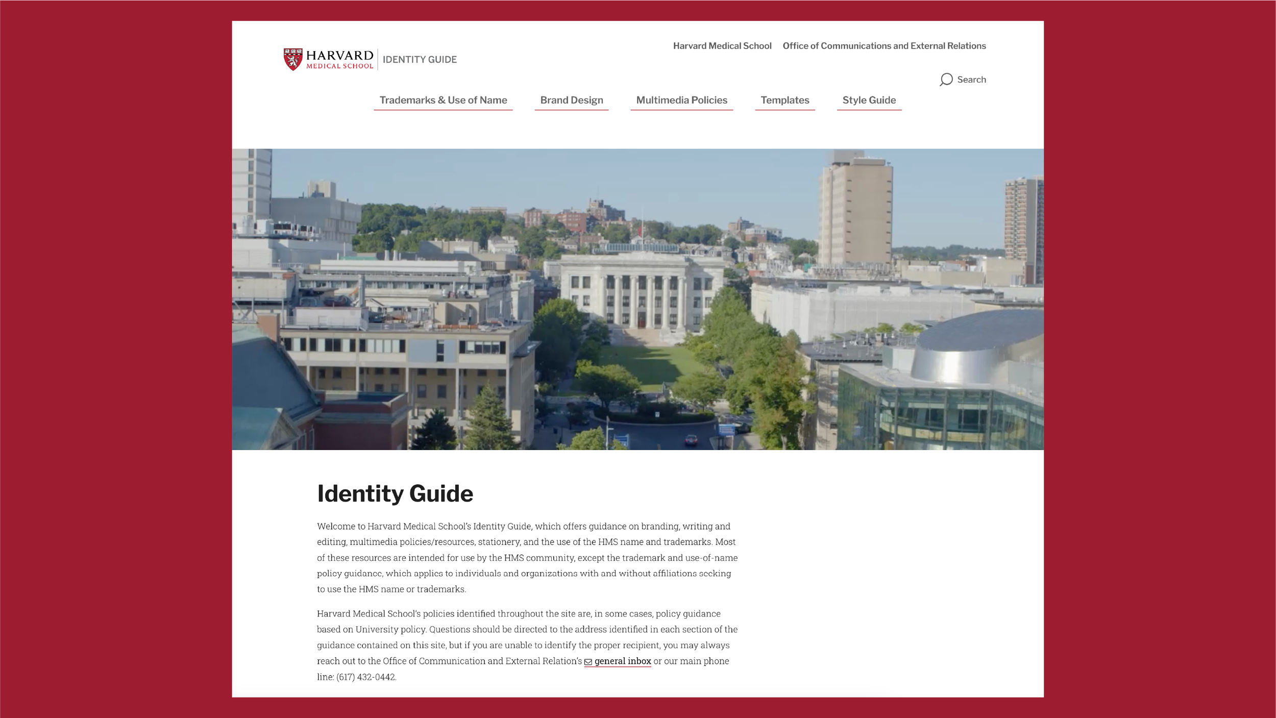
HMS Identity Guide
Project Overview
Role: UX & Lead Designer
Team: Digital Team | Communications Office | IT
Timeline: 2023 – 2024
Tools: Miro, Adobe Creative Suite, Drupal CMS
Problem
The Office of Communications and External Relations at Harvard Medical School had two different brand websites, internally and externally, that cited outdated rules and regulations by several years. Both sites were difficult to navigate and were lacking cohesive layouts for users who are seeking information on brand standard guidance, or where to receive digital assets. The goal was to overview all information (branding standards, rules and regulations, guidance) and create a user friendly website that is intuitive and efficient for a variety of internal users.
Users
Primary users:
Internal stakeholders (communications office, marketing for the school, design teams) looking for branding standards and contact information
Faculty and staff needing guidance for brand, or event, collateral
External audiences needing to reference and understanding the school’s rules and regulations
Each group had a different need for what this new website should have in terms of information and usage. The user experience for this website needs to be easy to navigate, and able to house a lot of necessary information.
Challenges
Outdated information that has no clear hierarchy or consistent layout.
Navigation was not leading users to the information they needed.
Lack of structure with content types (rules and regulations, digital assets, and examples).
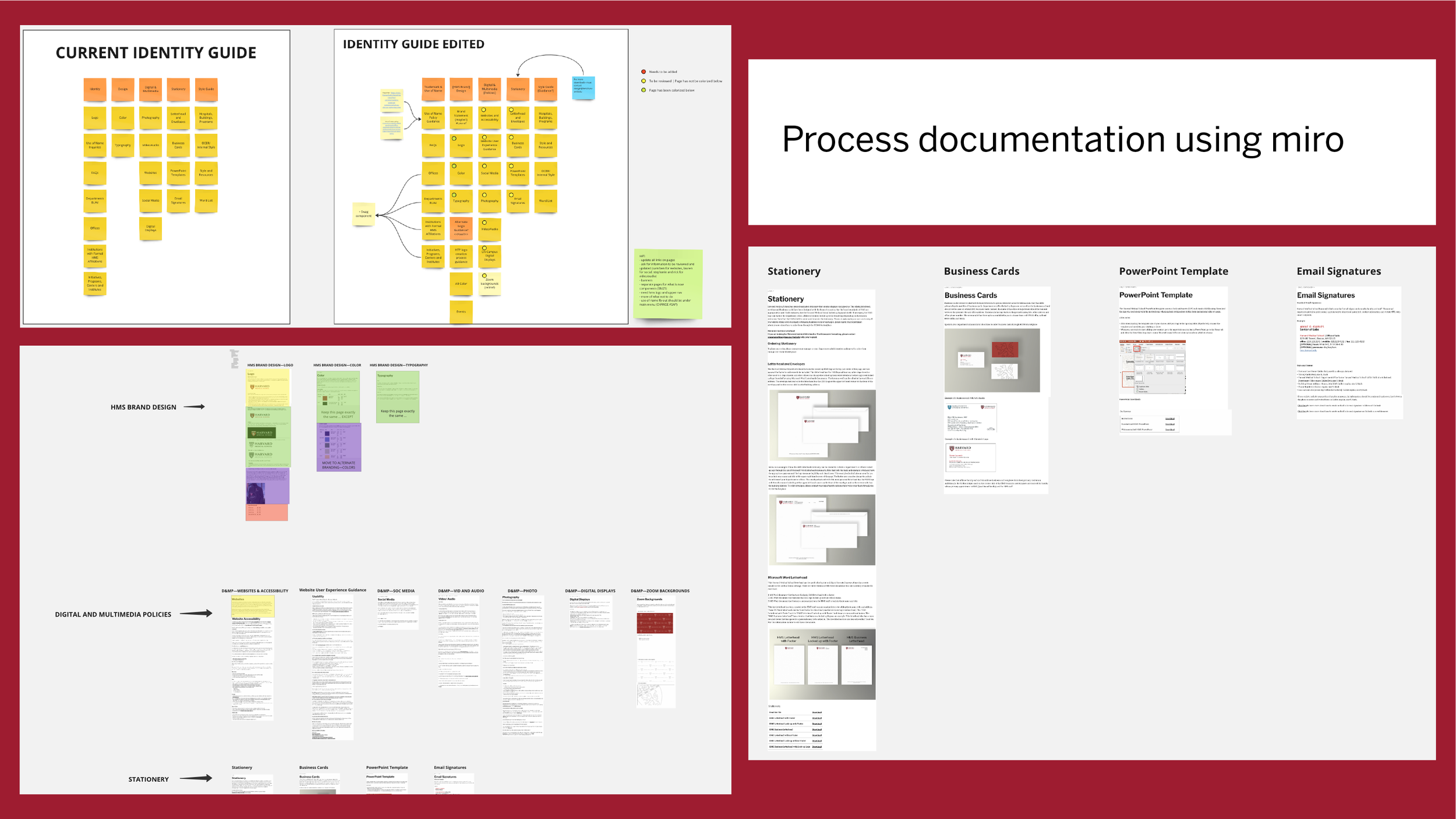
Process
-
Reviewing and processing all information existing on both websites. Pinpointing exact issues:
Duplicated content
Outdated rules and regulations
Lack of security for asset downloads
Unclear labels in structure navigations
Missing guidance, and lack of accessibility
Spoke with editorial team, communications team, and HMS Use of Name policy adviros to understand:
What is the most searched for items and guidance.
Which assets do they find themselves reaching for most, and where they go to seek for more information or need for more assets.
What is lacking for users.
-
Used information from the reviews given by stakeholders to:
Restructure information grouping
Create clear navigation
No outward facing assets—all are to be offline for security purposes
Sketch wireframes to see all information flow
Layouts were reviewed with Use of Name policy stakeholder, communications team, and design before going further.
-
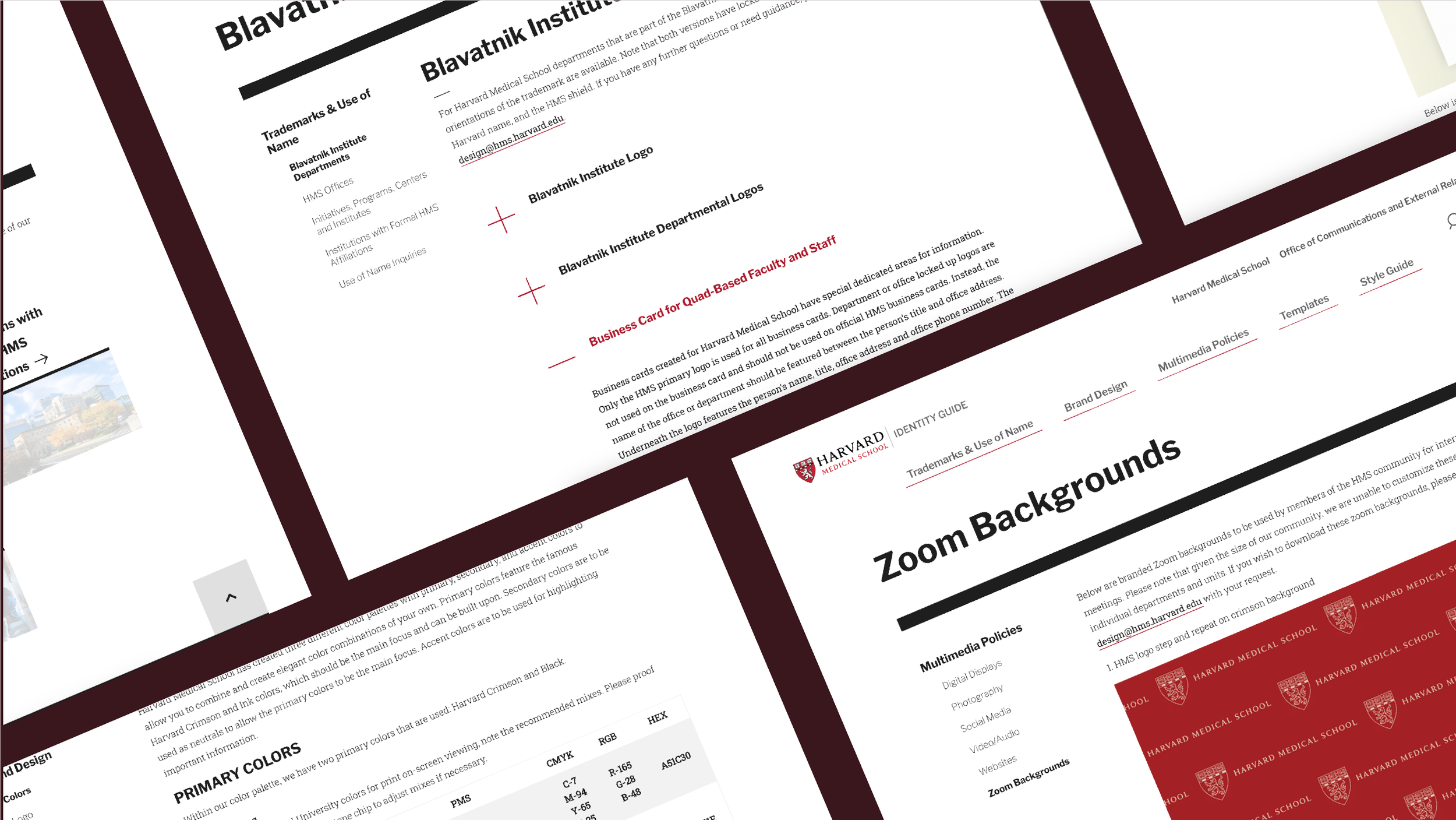
From the approved wireframes, I used high detailed layouts using:
Typography and spacing that follows the Harvard Medical School’s main website visual structure
Components that are easy to navigate
Color and style rules following HMS brand
Maintaining brand integrity while ensuring information and website usability are the core focus.
-
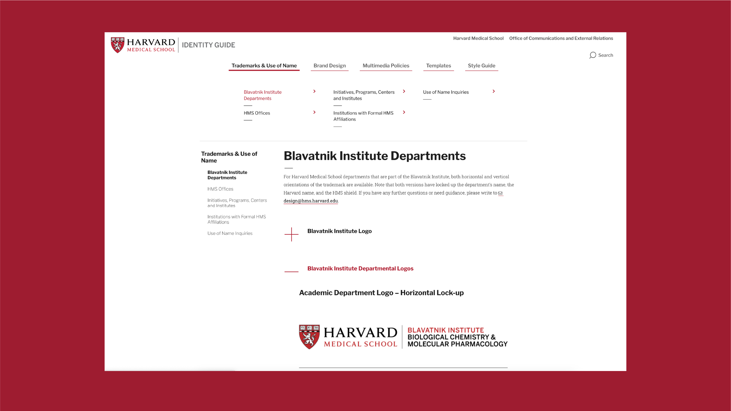
I used Drupal CMS to fully build out the new website. I ensured that the website:
Used new and approved information
Had easy navigation for the website’s user needs
Ensured visual branding consistency
Formal metrics were not logged; however, feedback from users have confirmed the usability of the Identity Guide has improved significantly.
Outcomes
The new Identity Guide website delivered clear structure, and updated information hierarchy for stakeholders and users. It has allowed users to find needed information faster while also giving clear structure to help support additional guidelines and assets for future growth.