UX & Design Project
Web Components

Web Components
Project Overview
Role: UX & Lead Designer
Team: Digital Team | Editorial Team | Communications Office | IT
Timeline: 2024 – 2025
Tools: Adobe Creative Suite, Drupal CMS
Problem
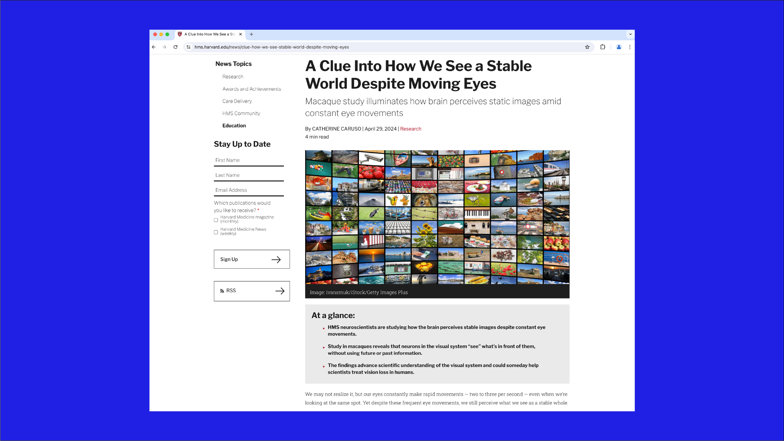
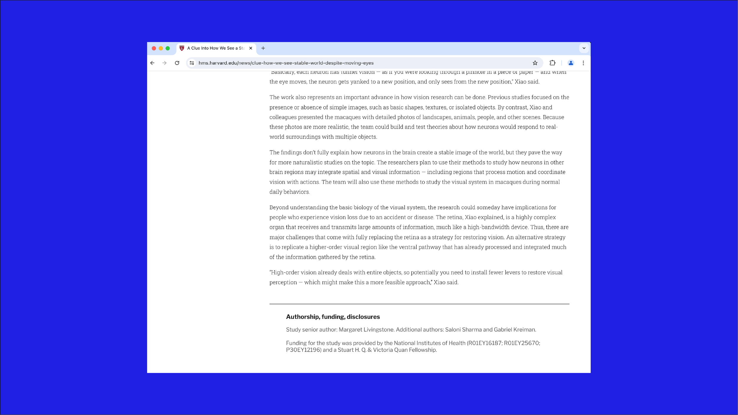
Articles in the Harvard Medical School’s news section lacked a clear summary and author attribution, which made it difficult for viewers to quickly scan key points and sources.
Users
Primary users:
Internal stakeholders (communications office, science writers, editorial team)
Harvard faculty and staff (educators, researchers, medical educators)
External audience interested in medicine and science news
Challenges
Designing new components that will work within existing CMS and layout constraints of the HMS website
Creating subtle but effective design to improve quick readability and clarity without distracting the reader from article content
Ensuring both components work across different article templates
Process
-
I collected information on news websites that have existing quick key points for readers at the top of articles, and additional authorship information at the bottom. Reviewed:
Which examples were simple and effective
How typography and color were incorporated to components
After reviewing these existing site components and collecting information, I presented to the editorial team and communications team on:
What was the most effective design for readers to quickly scan
What can be seen as problematic design and what to avoid
What can be improved for users to have a more enjoyable experience
-
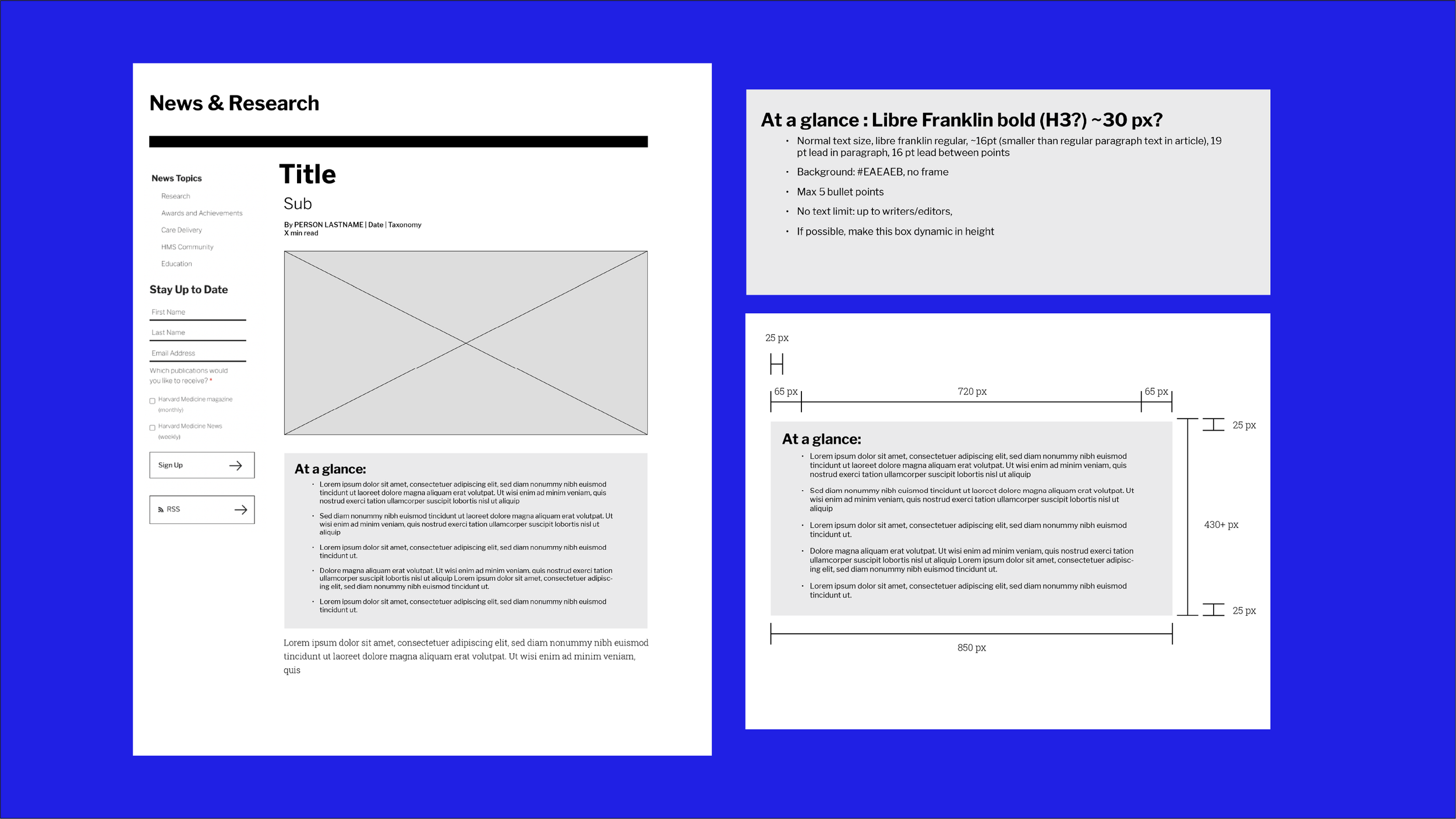
After my discussions with stakeholders during the overview process, I created wireframes. My focus on the top key points component:
Create an easy to understand adjustable 1-5 bullet point list for viewers.
Max character limit and bullet points establishment.
Use “At a Glance” to name this component as per requested by editorial team.
Placement and sizing to match to existing news articles.
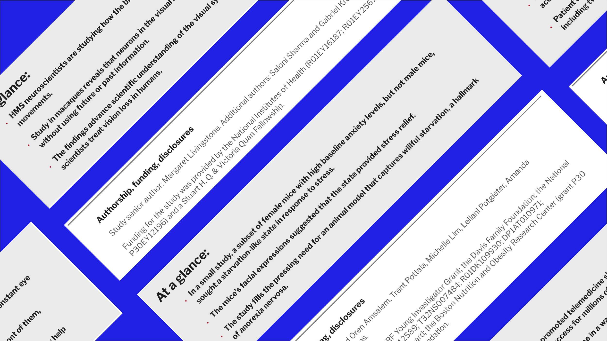
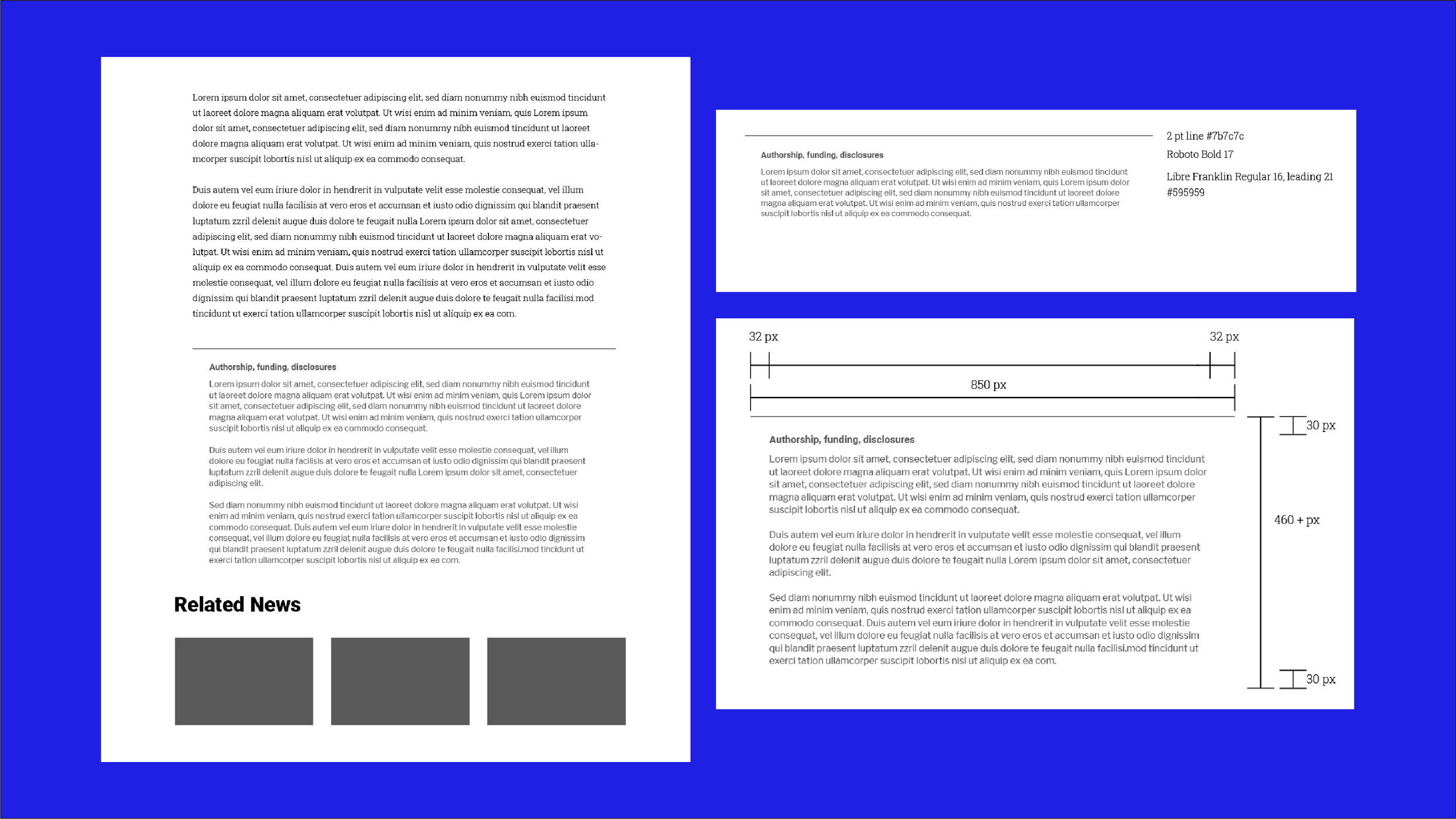
The focus on authorship, funding, and disclosures component wireframe was:
Create a design to allow viewers to quickly understand this was secondary information to accompany the article.
Establish sizing of component, typography and design.
Wireframes were reviewed with editorial team, communications team, and IT.
-
From the approved wireframes, I used high-fidelity layouts for both components to:
Refine typography
Finalize spacing
Establish visual hierarchy
-
Following the approval of the high-fidelity designs, I worked with IT to implement the two components within the existing Drupal CMS article templates. The “At A Glance” summary was optimized for quick scanning and reading flow, and the authorship disclosure component was designed to have contributor and source information available without competing with article content.
Outcomes
These new components improved article clarity by bulleting key takeaways through a scannable summary and making contributor and source material information more visible. Both component were designed as reusable modules to be supported in future iterations as the site evolves.